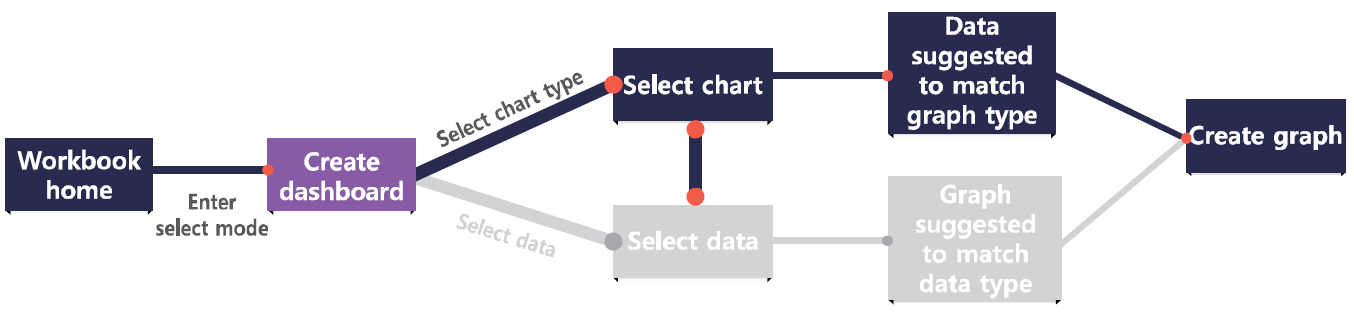
Select a chart type
Metatron Discovery provides about 20 types of charts. If you place columns on shelves before selecting a chart, suitable charts are highlighted in purple.
The table below summarizes conditions to create, uses, and examples for each chart.
Chart name/icon Conditions to create Characteristics Uses Examples
Bar chart
Column: 1 or more dimensions / Cross: 1 or more measures Compares the value of each item. Used to compare groups or view trends over time. Very effective when the trend is significantly fluctuating. Comparison between products regarding their sales and profits
Table
Column or row: 1 or more dimensions / Cross: 1 or more measures Displays the values of crossings between two dimensions as text. Used to view measure values aggregated by certain criteria. Useful to check exact values rather than a visualization of them. Sales details by year
Line chart
Column: 1 or more dimensions / Cross: 1 or more measures Displays data changes over time. Used to view trends over time. If changes are moderate, a line chart is more effective than a bar chart. Monthly sales trend
Scatter chart
Column: 1 measure / Row: 1 measure / Cross: 1 or more dimensions Displays relations between items. Used to define relations between two parameters. Relations between product sales and profits
Heatmap
Column or row: 1 or more dimensions / Cross: 1 or more measures Displays the values of crossings between two dimensions in colors and sizes at different points. Used to provide an intuitive view of relations between two dimensions represented by colors and sizes. Similar to a table chart, but more of a visual type. Sales of each product by region
Pie chart
Cross: 1 or more dimensions, 1 or more measures Shows how much each item accounts for. Used to compare the compositions of something. Comparison between web browsers regarding their market share
Map view
Layer shelf: dimension (location attribute), 1 or more dimensions, 1 or more measures Displays the data for each location on the map. Used for intuitive comparisons of variables by using colors for each region. Used to emphasize visual elements. Comparison of sales of each product by region
KPI
Cross: 1 or more measures Displays main indicators along with their trends. Used to quickly convey information on an organization’s current achievement. An organization’s performance index, such as how many customers have been brought in this year
Box plot
Column: 1 or more dimensions / Row: 1 dimension / Cross: 1 measure Indicates increase and decrease in value. Used to compare groups regarding their share. Proportion of flight delay accounted for by each airplane model
Waterfall chart
Column: 1 time-dimension / Cross: 1 measure Displays cumulative changes resulting from the increase or decrease in value for each time interval. Used to emphasize increase and decrease in value over time. Changes in the number of team members for a certain period; stock price trends
Word cloud
Cross: 1 or more dimensions, 1 measure Displays words sized in proportion to the number of mentions. Used to summarize and emphasize important words. Summary of the voices of customers
Combo chart
Column: 1 or more dimensions / Cross: 2?4 measures Compares data by combining bar and line charts. Used to visualize different types of data simultaneously. Simultaneous monitoring of product price and sales
Treemap
Column: 1 dimension / Row: 1 or more dimensions / Cross: 1 measure Displays hierarchical data using nested rectangles. Used to visualize hierarchical data. Monitoring of sales of products classified into major, medium, and minor categories.
Radar chart
Cross: 1 dimension, 1 or more measures Displays different quantitative variables on axes starting from the same point. Used for a visual comparison among different quantitative variables. Product quality evaluation in five aspects.
Network diagram
Subject shelf: 1 dimension / Target shelf: 1 dimension / Connecting shelf: 1 measure Diagram connecting elements in dependence relations Used to view data flows regarding where data elements are generated. Monitoring the task flows of a project
Gauge chart
Column: Row: 1 or more dimensions / Cross: 1 measure Visualizes performance for the specified target. Used to view the proportions of data elements. Monitoring of profits by region
Sankey diagram
Column: 3 or more dimensions / Cross: 1 measure Displays the proportion of each data flow by the width of the connection line. Used to monitor data flows and their respective sizes. Monitoring energy flows in a factory


