Chart style attributes
Once data is pivoted, an options menu is shown on the right of the screen to allow you to set the chart style. The composition of the menu varies with chart type. This section describes the settings used universally by all chart types and the “Common Setting” items for each chart type.
Chart style settings menu
This section describes how to configure the settings of the chart style settings menu. Note that not all the settings are shown for every chart type.
Color setting
Defines various colors used in the chart.
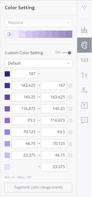
Graph color setting: Set criteria to classify data on the chart by color, and select a coloring theme.
- Series: Colors data elements differently with measures.
- Dimension: Colors data elements differently with dimensions.
- Measure: Colors elements differently with the size of each aggregate of measure values.
Setting color range: This setting is displayed when Measure is selected as the criterion to classify data by color. Set “ON” to set colors differently with each range of measure values. The measure data to be colored can be subdivided into as many ranges as you want, starting with the lowest one. To add a new range, adjust the upper limit of the highest range and click Add new range.
Number format
Defines how to display numerical text data on the chart graph. To use this function, turn on Show Axis Label in the Data Label Settings Menu.
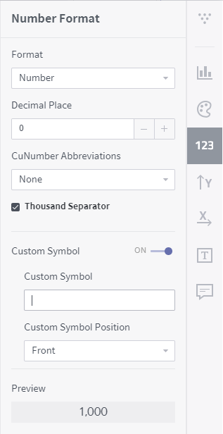
- Format: Select a display format for numeric values from among number, currency, percent, and exponent.
- Decimal place: Set how many digits to display after the decimal point.
- Number abbreviations: You can use K (thousands), M (millions), or B (billions) as an abbreviation for a large numeric value. Select Automation to automatically set the most proper symbol in accordance with the number of digits.
- Thousands separator: Select whether to add thousands separators when displaying numeric data values.
- Customer symbol: Insert a custom text before/after numeric data values.
- Preview: Displays the result of the defined number format.
Y-axis setting (when chart type is vertical)
If you set the chart direction Horizontal in the Common Setting area, the settings are exchanged between X-axis and Y-axis.
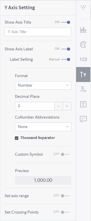
Show axis title: Used to set a title for the Y-axis of the chart. Disabling this function hides the title of the Y-axis.
Show axis label: Select whether or not to show the data labels on the Y-axis of the chart. Disabling this function hides the data labels on the Y-axis.
- Label setting: Set the numeric format of the data labels on the Y-axis. Set automatic to import the settings of Format or manual to set specific format for the data labels on the Y-axis.
X-axis setting (when chart type is vertical)
Defines how to display the X-axis of the chart. If you set the chart direction Horizontal in the Common Setting area, the settings are exchanged between X-axis and Y-axis.
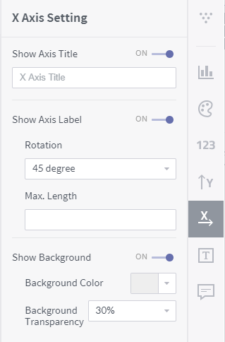
Show axis title: Used to set a title for the X-axis of the chart. Disabling this function hides the title of the X-axis.
Show axis label: Select whether or not to show the data labels on the X-axis of the chart. Disabling this function hides the data labels on the X-axis.
- Rotation: Select an angle for the data labels on the X-axis from among 0, 45, and 90 degrees.
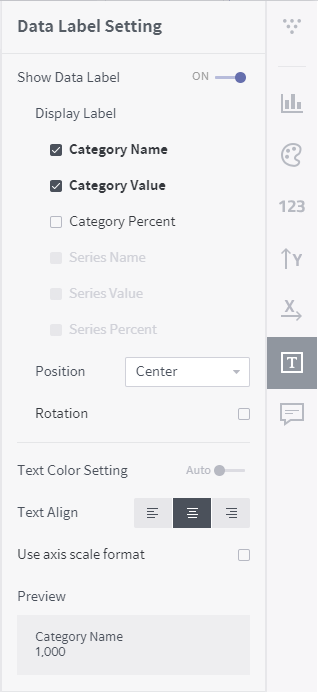
Data label setting
Selects whether to display the data values on the chart graph.
Common settings for each chart type
This section describes how to style the six most popular chart types (bar chart, table, line chart, scatter chart, heatmap, and pie chart).
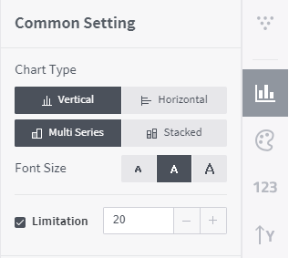
Bar chart
This type of chart presents data values in each category of a dimension column with rectangular bars.
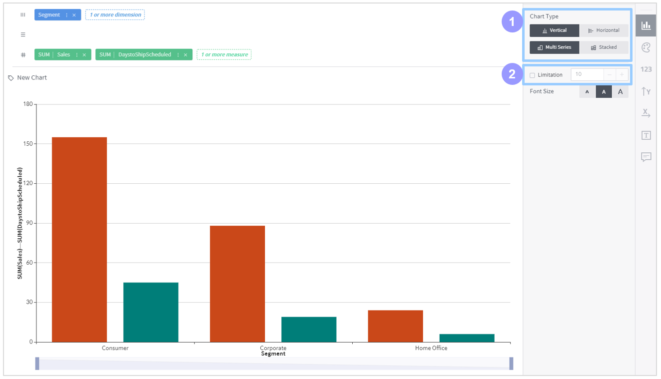
Chart type
- Vertical: Displays data values as vertical bars with the dimension axis set vertical.
- Horizontal: Displays data values as horizontal bars with the dimension axis set horizontal.
- Parallel: If more than one measure are selected, different bars representing those measures are displayed in parallel.
- Stacked: If more than one measure are selected, different bars representing those measures are stacked at one position.
Limitation: Set how many columns to display on the chart.
Table
A table block is formed based on the categories into which the dimension columns on the column/row shelves are grouped; accordingly, the values of the measure columns on the cross shelf are displayed as text in the crossings.
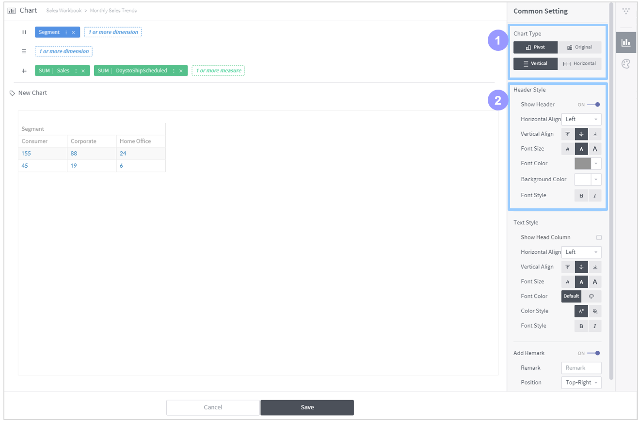
Chart type
- Pivot: Aggregates (
SUM,MIN,MAX, etc) measure values for each pair of column and row dimensions into a different cell.- Original: Displays all original measure values as unaggregated together with the selected dimensions.
- Vertical: Displays measure values vertically in the table. This cannot be used when “Original” is selected for displaying the table.
- Horizontal: Displays the table horizontally when “Pivot” is selected for displaying the table. Displays measure values horizontally in the table.
Show head column: Set horizontal and vertical text alignment in the column headers. When “Original” is selected, the column headers are necessarily shown. When “Pivot” is selected, you may optionally hide the column headers.
Line chart
This type of chart presents data values in each category of a dimension column with points. Adjacent data points are connected with each other. This type of chart is used to view trends.
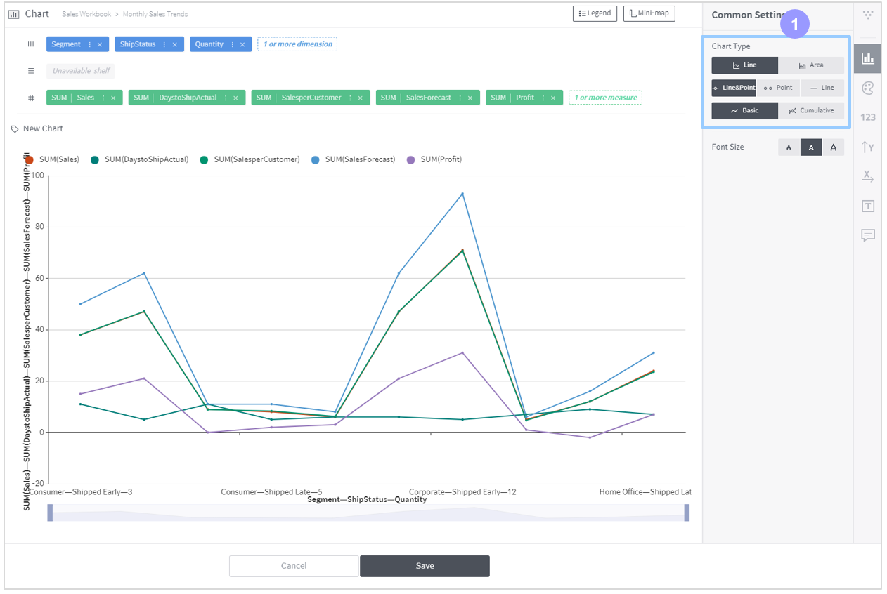
Chart type
- Line type: Displays the chart graph by drawing lines between points that represent measure value aggregates.
- Area type: Colors the area formed by the connecting lines.
- Line & point: Shows both the data points and connecting lines.
- Point: Shows the data points only.
- Line: Shows the connecting lines only.
- Basic: Displays each aggregate as it is on the chart.
- Cumulative: Displays cumulative aggregates on the chart.
Scatter chart
This type of chart presents data values in each category of a dimension column with defined symbols.
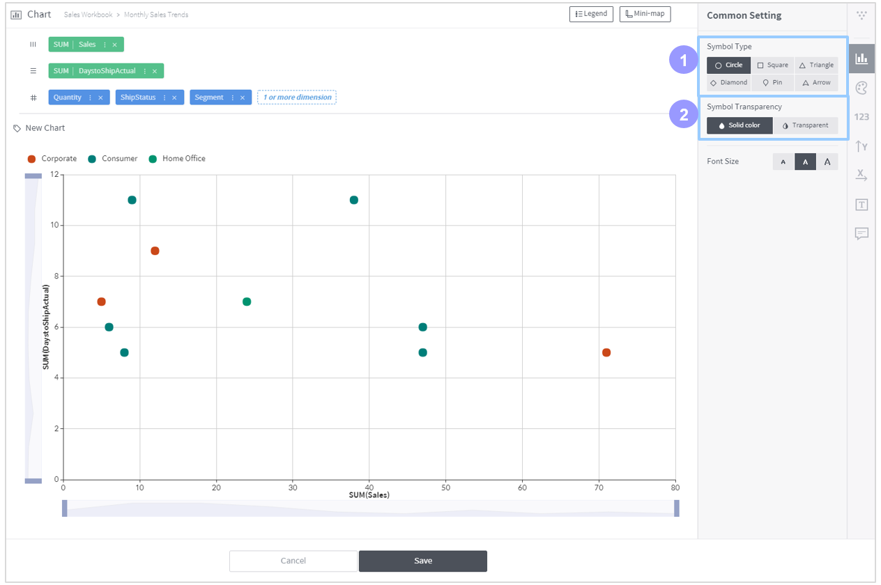
- Symbol type: Set the shape of the symbol to be shown on the chart.
- Symbol transparency: Set the transparency of the symbol to be shown on the chart. You can set colors either solid or transparent.
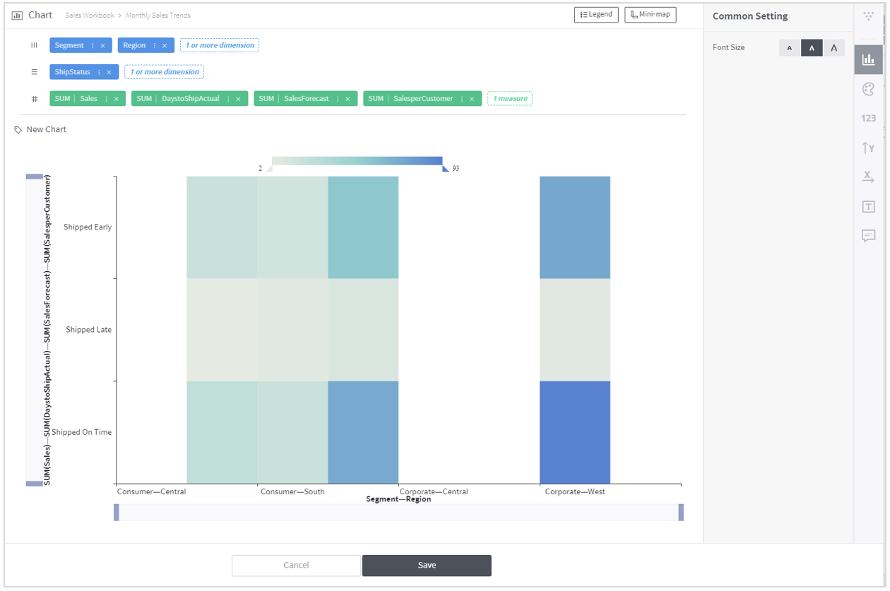
Heatmap
This type of chart displays values aggregated from the measure column placed on the cross shelf by using colors. For a larger aggregated value, a darker color is applied. The heatmap type does not provide any common settings.
Pie chart
This type of chart visualizes the proportion of each category of the dimension column.
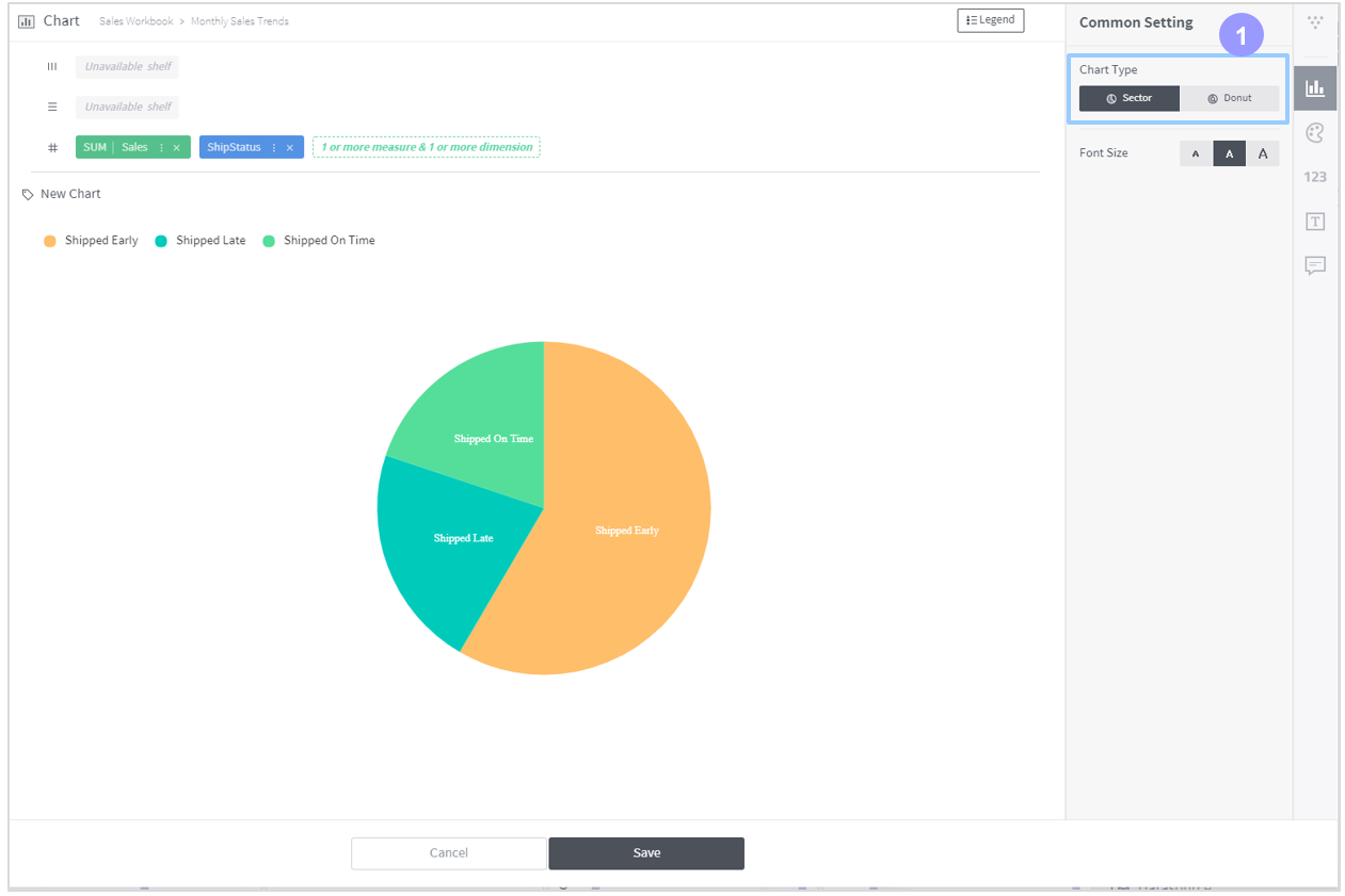
Chart type
- Sector: Displays a pie-shaped chart.
- Donut: Displays a donut-shaped chart.